About Graphic Design II
Graphic Design II is about utilizing skills from Graphic Design I to develop a brand to work on for the semester. Throughout the course, we started with thumbnail sketches before diving into Adobe Illustrator so we could explore multiple design opportunities before settling on an idea. Branding is about having a consistent look and feel along with a cohesive design. Branding is essentially used in everything, and graphic design is a big part of branding, as it can be seen nearly everywhere. Effective branding comes with a lot of planning and having a reference to look back on when creating another product or design for the brand. Starting with a brand board is the most effective step for branding, because it's important to put creative limits for yourself when you start a project so you don't feel so overwhelmed with limitless choices. For my brand, Apple Palooza, I repeated a lot of elements in my brand to provide a sense of unity. After I figured out my brand board, it was easier to create future designs because I used my brand board as a reference whenever I hit an art block. However, typography was one of the hardest challenges for me in this unit, since it plays a bigger role in Graphic Design II than I.
|
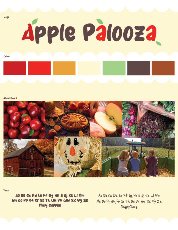
Brand BoardA brand board is to help keep a consistent design while branding. A brand board includes a name for the brand, colors that the brand will be recognized by, a mood board to get a feel for the brand, and fonts that the brand will use. Before creating the brand board we planned out our unique selling point, ideal customers, and adjectives that come to mind when we think about our brand.
Initially, I wanted to make red the theme color for my brand and use green as an accent, which is why I have two reds in my colors section. However, as I explored different colors throughout the designing process, I found that green was much easier on the eyes so I kept using it until it became my theme color, with red as an accent. If I were to make my brand board again, there would only be one red instead of two. |
|
|
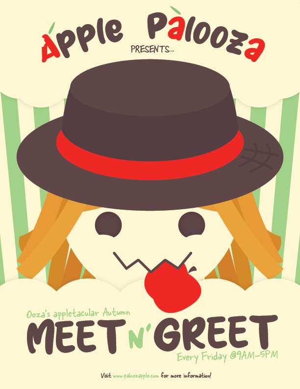
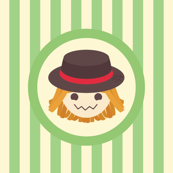
Logo & Sticker DesignWhile making the stickers we also made our logo. At first I wanted my logo to be the green apple with a unique bite mark in it, a bite mark that came from my mascot. Although I ended up just not doing that and using the scarecrow as my logo instead. My logo expresses the identity of a business by having a farm feeling with the scarecrow as a mascot, but keeping the theme of apples by putting an apple in the scarecrow’s mouth.
When we were first making the logo, we were supposed to use the Golden Ratio to make sure out logo would be aesthetically pleasing. While I didn’t make the logo with the golden ratio in mind, after testing it out in Illustrator, the focus point of the ratio closely matches one of eyes of the scarecrow. The logo can lead the eye from the hat, down the side of the face, to the apple in the mouth, then to the eye. |
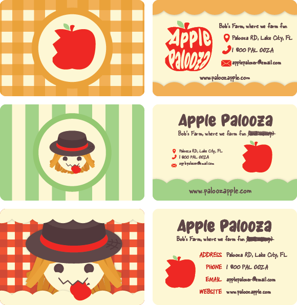
Business CardsThe business card designs are coherent with the brand of my company because they all have a matching color scheme. I figured that since these are really the first brand designs that I'm making specifically for business, my theme color wasn't decided yet. After making the card designs, I went with the green one in the middle because I like the margin and proximity in it.
|
|
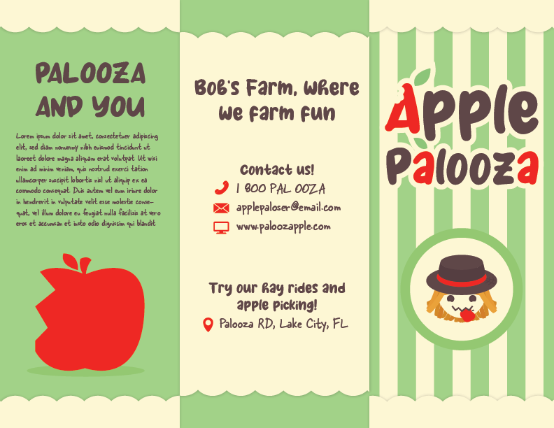
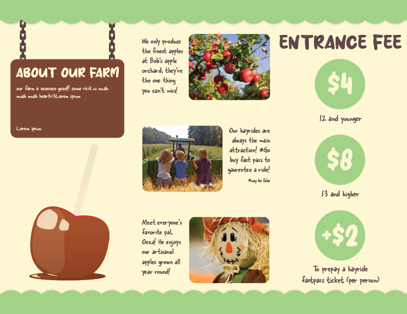
Brochure DesignWhile it was fun to make a brochure, I wish I used less shadows around the cloudy border because when it was printed the shadow didn't show up, which happened with some other gradients I used in my designs. The brochure was fun to make because there were guidelines in Adobe Illustrator that separated the art boards into thirds. At first, I didn't know how to approach this project. I had the same problem that I had with the business cards, not knowing my theme color yet. However I ended up just referencing my whole brochure off the green business card design.
If I could do this again, I wish the second page of the brochure looked more complicated with it's design. Instead, it looks like the elements were just slapped on there. Also, I couldn't get the place holder text in the "About our Farm" section to work properly, so there's just an unsatisfying gap there. In the future I will make designs with less empty space. |
|
|
PosterFor my poster, I was proud of what I came up for this design. I kept green as the background color since it's a cool color and it complements the warm colors in the front. However, there's a problem with this assignment that I also had with the previous assignment, it's that the shadows didn't get printed properly which makes the cloud and the scarecrow have nothing to separate each other. Thanks to this, I know that in future designs I should add more contrast in my designs and not rely on shadows or gradients so much.
|
|
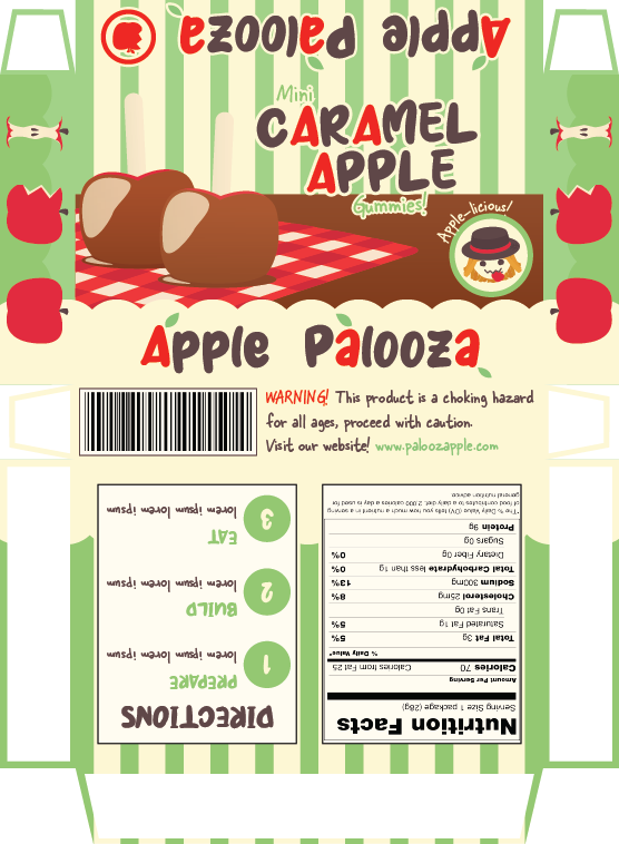
Packaging DesignI wanted the design for this project to communicate a childish and fun feeling since this is supposed to be a DIY candy food snack kit. In order to achieve this I adjusted the proportions of the caramel apples so they looked like a 1:1 ratio, while the more realistic caramel apples aren't 1:1 because the popsicle stick is longer. Additionally, I didn't provide a lot of shine on caramel apple so it looked more simplified and cartoon-y. Out of all the designs so far, I liked the way this one looked when it was printed, most likely because there aren't that many gradients.
|
Gif Animation
I was most excited for this project because out of all the art mediums, I consider animation to be my strong suit. However, using Adobe Illustrator and Photoshop for animation wasn't what I was expecting, and Photoshop's animation program wasn't what I expected either. Photoshop is completely different than the program I'm used to using, and different from other programs that I've seen before. Even with that in mind, I wouldn't say I had that much of a difficult time with this project. But with the way this program operated with animation discouraged me to aim for something more ambitious because it was limiting compared to other programs that are actually built for animation. In the end, I still completed the objective of making a repeatable animation of the brand's mascot, however I finished this project early and had free time so I wish I used the free time to improve this animation and clean it up a bit.
